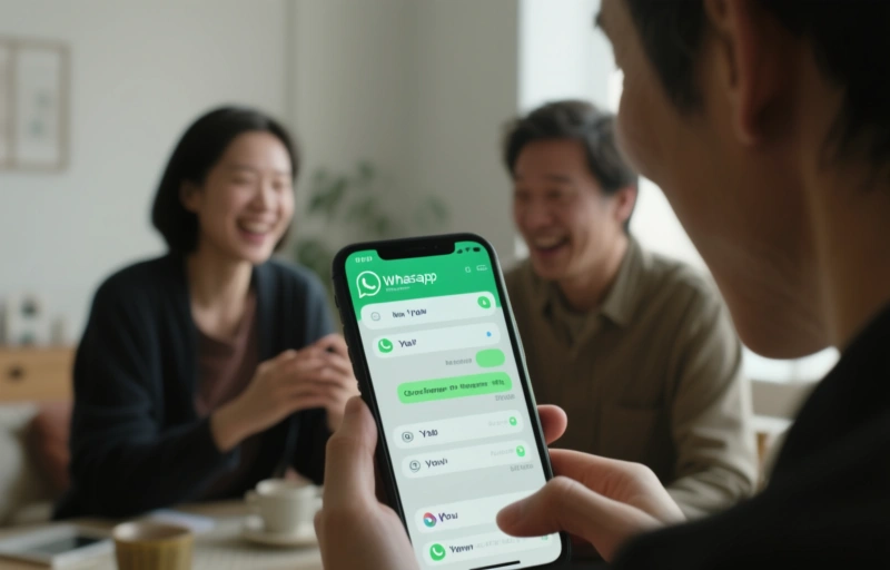
So, WhatsApp just rolled out a pretty significant update for iOS users. They've replaced the traditional Settings icon with a new "You" profile tab. It's not just a cosmetic change—it's a complete rethink of how you manage your account. And honestly, it feels like they're laying the groundwork for something bigger.
If you're an iPhone user, you've probably already noticed the change. That little gear icon in the bottom right corner? Gone. In its place, you'll find a tab labeled "You." Tap it, and you're taken straight to your profile, settings, and linked devices. It's cleaner, more intuitive, and frankly, long overdue.
### What Does the New 'You' Tab Actually Do?
The new tab centralizes everything about your account. We're talking profile picture updates, status changes, privacy settings—the whole nine yards. But the real magic is in how it streamlines navigation. No more digging through menus to find what you need. It's all right there, front and center.
This move signals a shift toward personalization. WhatsApp is putting *you* at the center of the experience. It's a small change with big implications, especially for how we think about our digital identities on the platform.
### The Multi-Account Readiness Angle
Here's where it gets really interesting for power users. This redesign isn't just about making things look pretty. The underlying structure screams "multi-account functionality." By creating a dedicated space for your personal account management, WhatsApp is clearly preparing to let users switch between profiles seamlessly.
Think about it. For professionals managing separate work and personal communications, or for anyone using WhatsApp for different projects, this could be a game-changer. The infrastructure is being put in place now, so when multi-account features do arrive, the transition will feel natural.
### Why This Matters for User Experience
User experience designers have been pushing for this kind of simplification for years. As one industry expert recently noted, *"The best interfaces disappear, letting users accomplish their goals without thinking about the tool itself."* WhatsApp's move to a "You" tab follows this philosophy perfectly.
- **Faster access:** Your most-used settings are now one tap away
- **Reduced clutter:** The interface feels less technical and more human
- **Intuitive design:** New users will find it easier to navigate
- **Future-proofing:** The structure supports upcoming features like multi-account
The update currently appears to be rolling out gradually to iOS users. If you don't see it yet, don't worry—it should reach your device soon through the standard App Store update process. Android users will likely see a similar redesign in the coming months, though WhatsApp hasn't announced an official timeline.
### Looking Ahead: The Future of Messaging Management
This update feels like just the beginning. As messaging apps evolve into full-fledged communication platforms, account management becomes increasingly complex. WhatsApp's solution? Make it personal. Make it about "You."
We're moving toward an era where our digital tools adapt to us, not the other way around. This iOS update is a small but significant step in that direction. It shows that even the giants are thinking about how to make technology work for people, not just the other way around.
So next time you open WhatsApp on your iPhone, take a moment to explore that new "You" tab. It's more than just a renamed button—it's a glimpse into how we'll all be managing our digital lives in the very near future.
While the primary focus of antidetect browsers is on managing multiple, isolated digital profiles for tasks like affiliate marketing or social media management, their utility extends into more traditional business operations, including recruitment and team building. For e-commerce entrepreneurs and agencies utilizing these tools to run several storefronts or ad accounts, scaling the business inevitably means assembling a skilled team to manage these complex workflows. Finding talent with the specific technical acumen for such a niche—understanding browser fingerprinting, proxy configurations, and multi-account management—can be a significant hurdle. This is where partnering with a specialized agency becomes a strategic advantage, much like using the right software is for profile management. A dedicated
ecommercerecruitment partner understands that the candidate who excels in a conventional digital marketing role may not possess the nuanced skills needed to securely and efficiently operate within an antidetect browser environment. They streamline the process of connecting businesses with pre-vetted professionals who are not only familiar with platforms like Shopify or Facebook Ads Manager but are also proficient in the tools that keep those operations separate and secure. By leveraging such specialized recruitment, e-commerce leaders can ensure their technical infrastructure is managed by capable hands, allowing them to focus on strategy and growth, confident that their most sensitive operational tools are in the care of experts specifically sourced for this modern e-commerce landscape.